Electric Vehicle
Subscription App

Flexible EV Subscription Without the Commitment

CONTEXT

STEER EV Subscription is a service that allows consumers (typically on a monthly recurring subscription basis) to choose from a diverse fleet of automobiles that includes a range of premium luxury and entry-level electric vehicles (EV) – without the hassles that come with long-term ownership or daily rental.

PROBLEM

With an existing business website, the company wanted to develop a mobile application that allowed users to browse, select and subscribe their desired plans, as well as used the app to get access to the car information, such as location, battery, mileage, billing, and other services.

TEAM

Two designers were responsible for creating the UX/UI, senior designer Mika Li, and junior designer Yongqi Chen.

AWARD

This project won the The Best Black App Designs issued by Design Rush.

UX Research

COMPETATIVE ANALYSIS

I carefully studied some car rental applications that were currently trending on the market, to analyze their UI design and see what unique features they provide.

TURO - the world’s largest car sharing marketplace. I especially liked the flexibility of its delivery/pick-up options. Customers could either choose a pick-up location for free, or pay an extra fee to get their vehicles delivered to their desired destination.

KAYAK - an online travel agency and metasearch engine that owns a car rental department. It compares rental car prices from all major car rental companies such as Thrifty, Dollar, Enterprise, Hertz, Payless and more to find customers the best deal.

Enterprise Rent-A-Car - America's largest transportation solutions provider. Having a reward system could increase user participation. It is a well-known design technique - gamification, to drive engagement to influence business results.

Define & Ideate

JOURNEY MAP

I created a customer journey map to build a better understanding of how customers find and interact with the application, and to discover opportunities for improvement. I illustrated the journey map for our potential customer - Thomas, from his situation regarding the steps he took to successfully subscribe to our service, and receive his first electric vehicle.

INFORMATION ARCHITECTURE  

Before starting the visual design, product managers, developers and designers held a meeting to discuss our research and findings. We then brainstormed features we wanted to build into the app and prioritized them from "High Difficulty" to "Low Difficulty" and from "High Impact" to "Low Impact".

Along with the user research that our product managers conducted, we had a clearer image of what the app should be like.By the end of the meeting, we were able to develop an information architecture that helped everyone within the team to have clarity of the project. A better understanding of the project scope enabled developers to provide more accurate estimates to managers and product owners.

Visual Elements

BRANDING

Our focus on SteerEV Subscription's branding was in many ways a pursuit of bringing the zero tailpipe emissions and clean energy to the market. It was also an opportunity for us to express our concerns for the environment in the greater effort of creating a more sophisticated end-product.

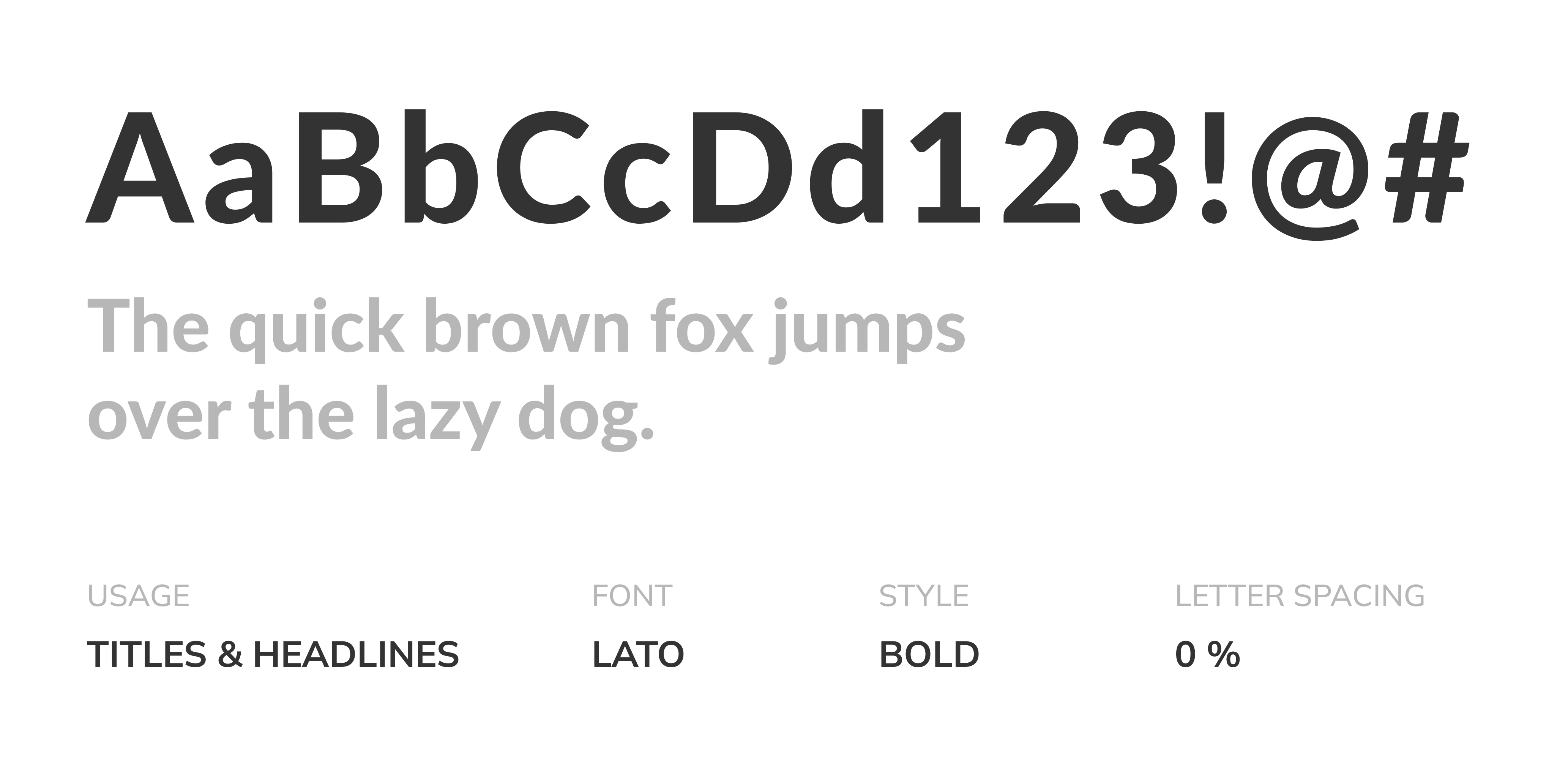
Before designing Hi-Fi wireframes, we defined the colour palette, typography, iconography and key interface elements that are appropriate for the target users. SteerEV Subscription's colour palette was largely inspired by the aesthetic of electrical vehicles & clean energy. So we decided to go with the combination of green, black and white to design the visual layers, including primary colours, background colours, text colours and error message colours.

Selected Mobile UI

FORMS

Despite the evolution of human-computer interaction, forms still remain one of the most important types of interaction for users. I understand that people who use the application have a particular goal, and filling out a form could be an annoying disruption.

As a UX/UI designer , I should strive to produce faster, easier and more productive form experiences for our users. So when designing the forms, I kept in mind that they should be user-friendly.

1. Let users know what to expect before filling out a form, so they can have all the information gathered and go through the steps smoothly

2. Grouping related questions in blocks to order the form logically

3. Field labels tell users what the corresponding input fields mean. A short and clear label text is one of the primary ways to make UIs more accessible

4. Understanding that typing is a slow and error-prone process, so I proposed that we should develop a feature of scanning to autofill, and the system should memorize repetitive answers such as email and mobile number

CONFIRMATION SCREEN

We put a lot of thoughts into this order confirmation screen, and it went through a few iterations.

The car model that users had chosen was a priority, so it was placed at top.In the middle was the driver information section. In the meeting we came to an agreement that a car could have multiple drivers (primary driver, secondary drive and etc.). So we decided to allow users to add more drivers in this step, so that we could verify their information all together.

Since there might be a situation that a car has more than one driver, we separated the payment method from the driver information.

The entire verification process could take up to 7 business days, so we removed the delivery location & date selection from this screen and put them to a later step.

The first billing cycle wouldn't start until the user received their car. Thus, while verifying or doing a background check on the user, we only took a $100 deposit to took the car out of the market and saved it for the user.

SUBSCRIPTION STATUS

I designed the three different status for the verifying process. On the left is screen for regularity update, the intention was to keep our users informed. In the middle is the screen that requires user's actions. On the right is the screen that user has been approved to subscribe, so they could proceed to the next step.

DELIVERY LOCATION SELECTION

In the meeting, product manager stated that there was a range in each city where our driver could deliver the car. So when designing the UI, I took the consideration that our users could choose a location that was out of our service range.

The logic is that users can either type in an address, or use their current location.

If they decide to use their current location as the delivery address and it is out of the range (example shown below), there should be a pop-up message indicating that we cannot deliver to this location, while also listing some suggested pick-up points on the map.

Users are able to choose one of the pick-up points and see the details, or they amy type in another address that is within the range (the yellow area on the map).

ORDER COMPLETION

After user has scanned the QR code they can follow the instructions to double-check the car information, and also inspect their car.

I did a research on some professional inspection forms and summarized an inspection checklist for both exterior and interior conditions. User can use the checklist to make sure the car they received is undamaged, and then proceed to complete the delivery.