UX Research
FINDINGS
To begin understanding the problem, I interviewed five bioinformaticians to gain insights into user pain points. Additionally, I conducted a heuristic analysis to identify design violations on the page. Below are the key findings from user research:
1. The page did not provide any summary statistics
2. The text within the columns was too long,
3. The filter system was not optimized for smaller(13-inch) screens
4. Users are unable to reset the filters
5. Users are unable to customize table columns


USER PERSONA
Based on insights gathered from user interviews, I created a user persona to better understand the needs and pain points of our target audience. The persona helped guide the design decisions by representing the typical users—bioinformaticians—who interact with the monitor page.
Define & Ideate
COMPETITIVE ANALYSIS
As part of the competitive analysis, I reviewed 10+ products that featured data dashboards to gather insights on best practices for data visualization and user interaction. This included well-known platforms such as Datadog, Tableau, Microsoft Power BI, Google Data Studio, Splunk, Kaggle, Looker, Kibana, Sisense, and Workday. By analyzing these products, I identified patterns and innovative solutions that helped inform the redesign, focusing on enhancing usability, data accessibility, and visual clarity.
WIREFRAMES
I created two sets of wireframes for the monitor page. Design 1 incorporated all four summary metrics into a single view; however, due to space limitations, the chart legends were only visible upon hovering over specific elements.
Design 2 displayed only two dashboards at a time, with a navigation system allowing users to switch between the four dashboards. This approach ensured that more space was available for displaying details and data, while still keeping the interface clean and intuitive.

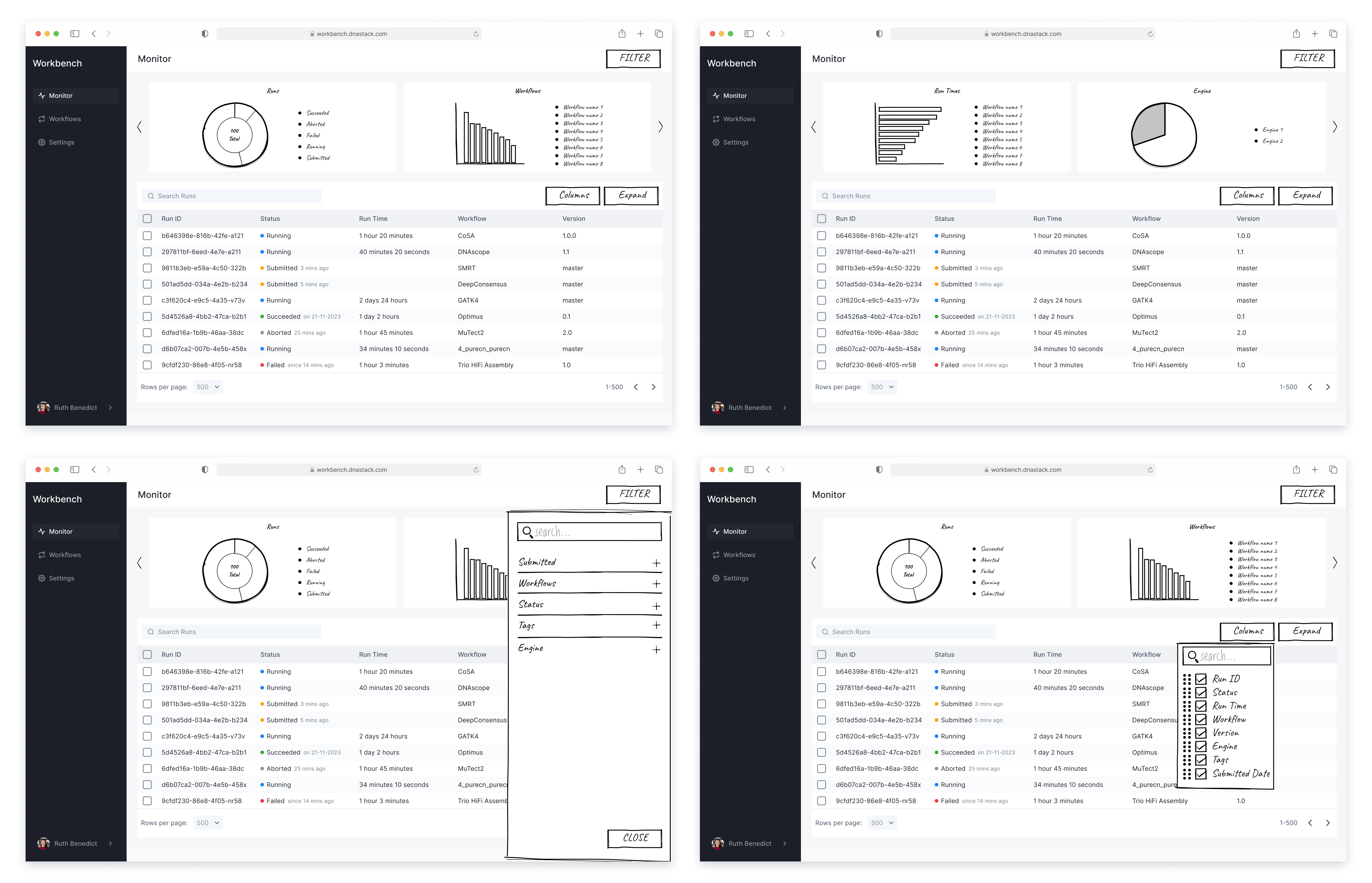
USER TESTING
After completing both sets of wireframes, I shared the designs with the team and conducted A/B testing to gather user feedback. A majority of users found Design 1 to be more visually appealing due to its comprehensive layout that displayed all four summary metrics at once. However, many users expressed a strong need to view the full legend at all times, without having to hover over the chart elements.
Based on the user feedback, I brainstormed creative ways to iterate my design while addressing the limited space and the need to display an extensive number of legends. To optimize space and avoid clutter, I introduced a toggle switch that allows users to show or hide the metrics for each chart.

COLOR PALETTE
I created this 10-color palette specifically for use in the charts. Each color was carefully selected to provide a balanced and visually appealing look, while also being distinguishable for various types of users.
To ensure accessibility, I conducted thorough testing on the color palette, verifying that it passes WCAG contrast guidelines and is suitable for users with color vision deficiencies.

Interactive Prototypes
DASHBOARD ANIMATION
Using Chart.js animations, the charts display a smooth intro animation each time they load, enhancing the overall visual appeal. Hovering over the chart triggers contextual tooltips, providing detailed information for each color-coded data point.
COLUMN EDITOR
The redesign allows users to fully customize their table view. They can select, deselect, and reorder columns to tailor the table and display the data in their preferred way.
NEW ACTION MENU
When hovering over a column, an action menu appears, allowing users to interact with each run. By eliminating the word 'Actions', this design creates a cleaner interface and reduces the number of clicks needed.
DEVELOPER HANDOFF
Since the dashboards were a new component for our products, I wanted to accurately highlight how they should behave in terms of user interaction. For instance, after researching chart animations, I found the desired intro animation using Chart.js and provided specific instructions to developers. My handoff included as many details as possible to avoid ambiguity. However, I always remained open to discussions with the developers should they need clarification or additional insights regarding the design.

Testing & Iteration
PRODUCT FEEDBACK
After implementing the new design, we conducted usability testing to gather feedback. Overall, the design was well-received, but users suggested a few areas for improvement. Based on this feedback, I iterated on the design to further enhance the overall user experience.
Feedback 1: Users expressed the need for a more interactive experience by allowing them to click directly on the charts to apply filters.
Feedback 2: Users expressed the desire to have the ability to adjust the column width within the table. This functionality would provide them with greater flexibility to view data in a more customized and accessible way.